MAURINE FOR HAMDEN
Maurine Crouch’s first campaign for Town Council called for a visual identity that balanced credibility, approachability, and a touch of rebellious energy. As a longtime figure in punk and grassroots activism, Maurine wanted a campaign look that felt modern and welcoming while subtly honoring the DIY spirit and bold voice that shaped her background.
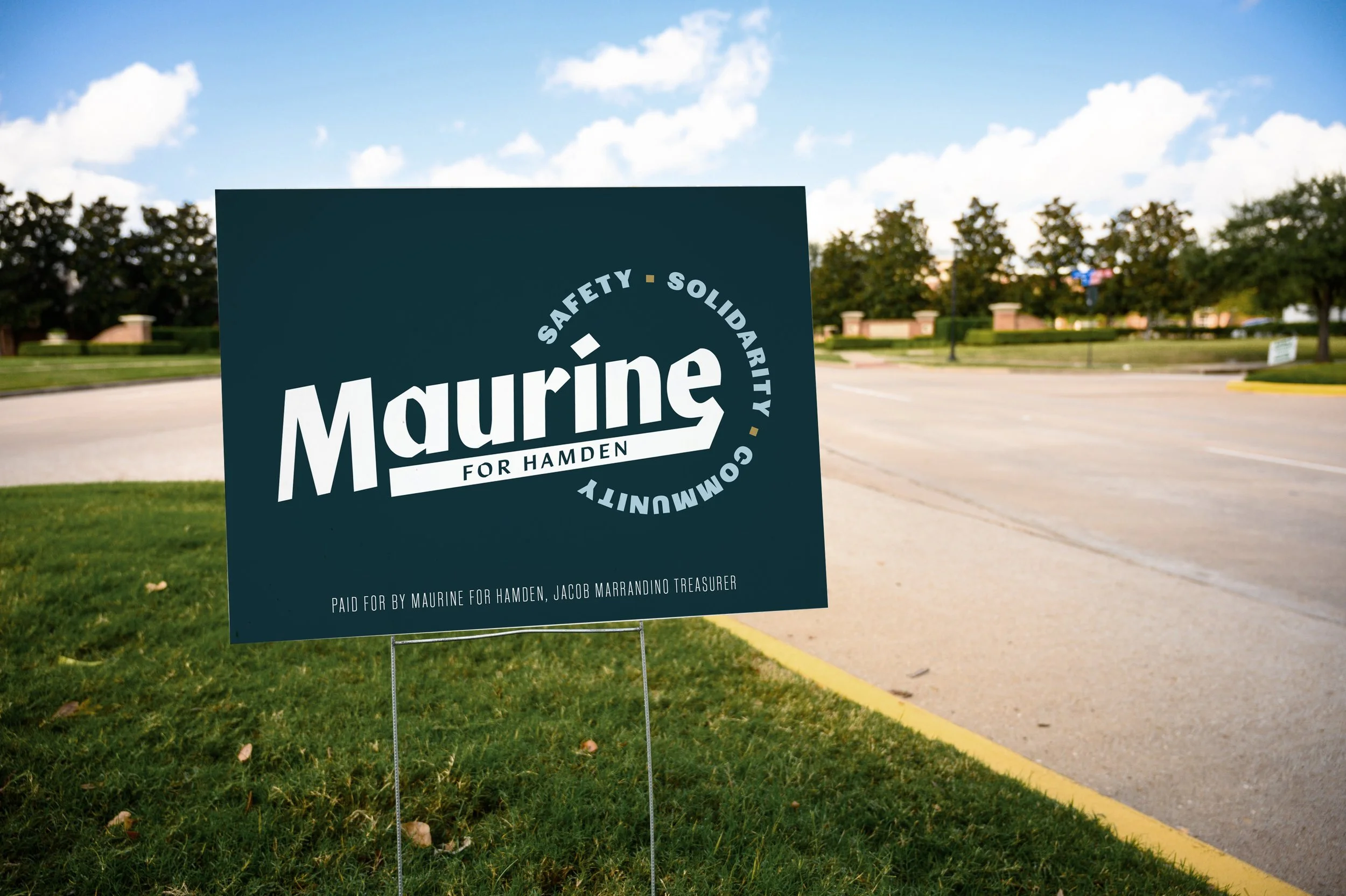
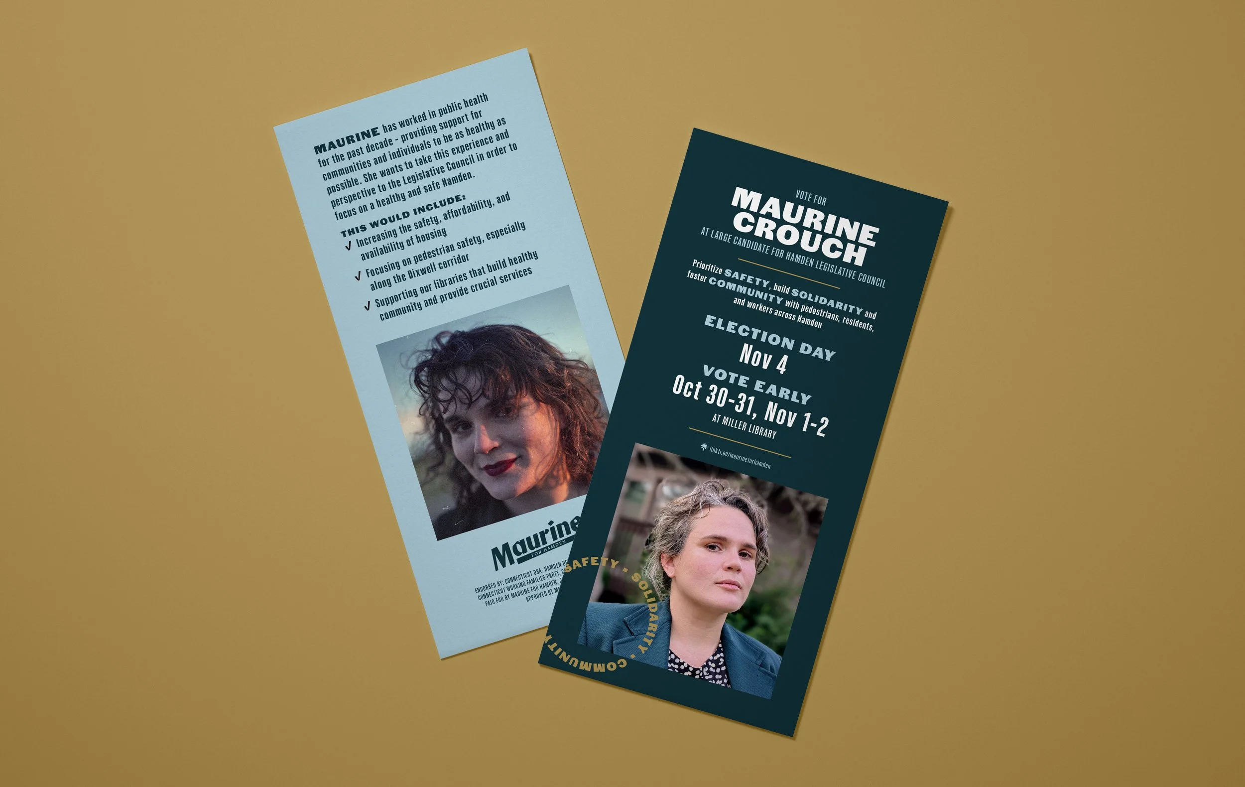
Early in the process, we established three guiding themes to anchor the campaign’s voice and visuals: safety, solidarity, and community. These ideas informed both the messaging and the design language, ensuring the campaign felt grounded in shared values while remaining clear and approachable for voters.
The design system combines clean, contemporary typography with graphic elements bridge civic professionalism with activist authenticity. The color palette reimagines the town’s traditional green and gold with refreshed, modern tones, reinforcing a connection to the community while feeling forward-looking. A calming sky blue was introduced to symbolize transparency, optimism, and the promise of clearer days ahead.
Together, these elements create a campaign identity that feels both grounded and energetic—reflecting Maurine’s commitment to accessible leadership, collective strength, and positive change.
ROLE
Design
Ideation
Art Direction